From Symptoms to Quick Insights: Accelerate Troubleshooting with OpenObserve's Insights Feature




Ready to get started?
Try OpenObserve Cloud today for more efficient and performant observability.
The 2 AM Page That Every SRE Dreads
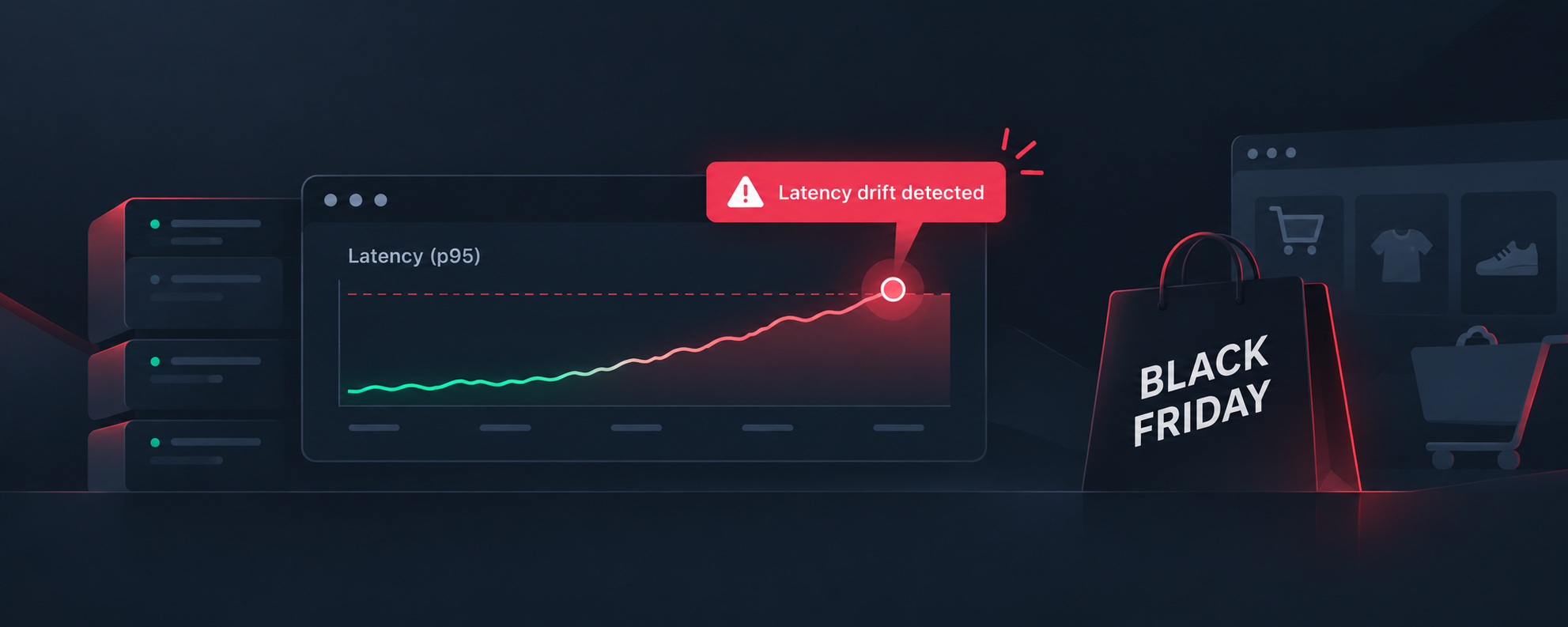
It's 2:00 AM, and your phone lights up with alerts. P95 latency has spiked from 200ms to 2 seconds. Your traces show thousands of slow requests. Your logs are flooded with error messages. The question isn't "Is something wrong?" - that's obvious. The real question is: What changed, and where?
Traditional observability tools show you the symptoms: charts with spikes, numbers in red, error counts climbing. But finding the root cause means diving into a maze of manual queries, filtering by dozens of dimensions, and comparing time windows by hand. By the time you identify that it's the payment-service calling a slow database query during checkout, you've lost precious minutes - or hours.
Modern distributed systems generate millions of telemetry events, but filtering signal from noise shouldn't require a PhD in SQL. That's why we built Insights - an interactive feature that helps you understand "Why it happened" by comparing anomaly periods against baseline data across multiple dimensions simultaneously.
Note: OpenObserve also offers an AI-powered SRE Agent for fully automated root cause analysis. Insights complements the SRE Agent by giving you visual, interactive control over your investigation - perfect when you want to explore hypotheses, validate findings, or learn from patterns manually.
Quick Start: Your First Insight in 5 Minutes
New to OpenObserve? Here's the fastest way to try Insights:
- Log into the web UI at
http://your-openobserve-url:5080 - Select a log stream in OpenObserve U and Click Run query (uses default settings)
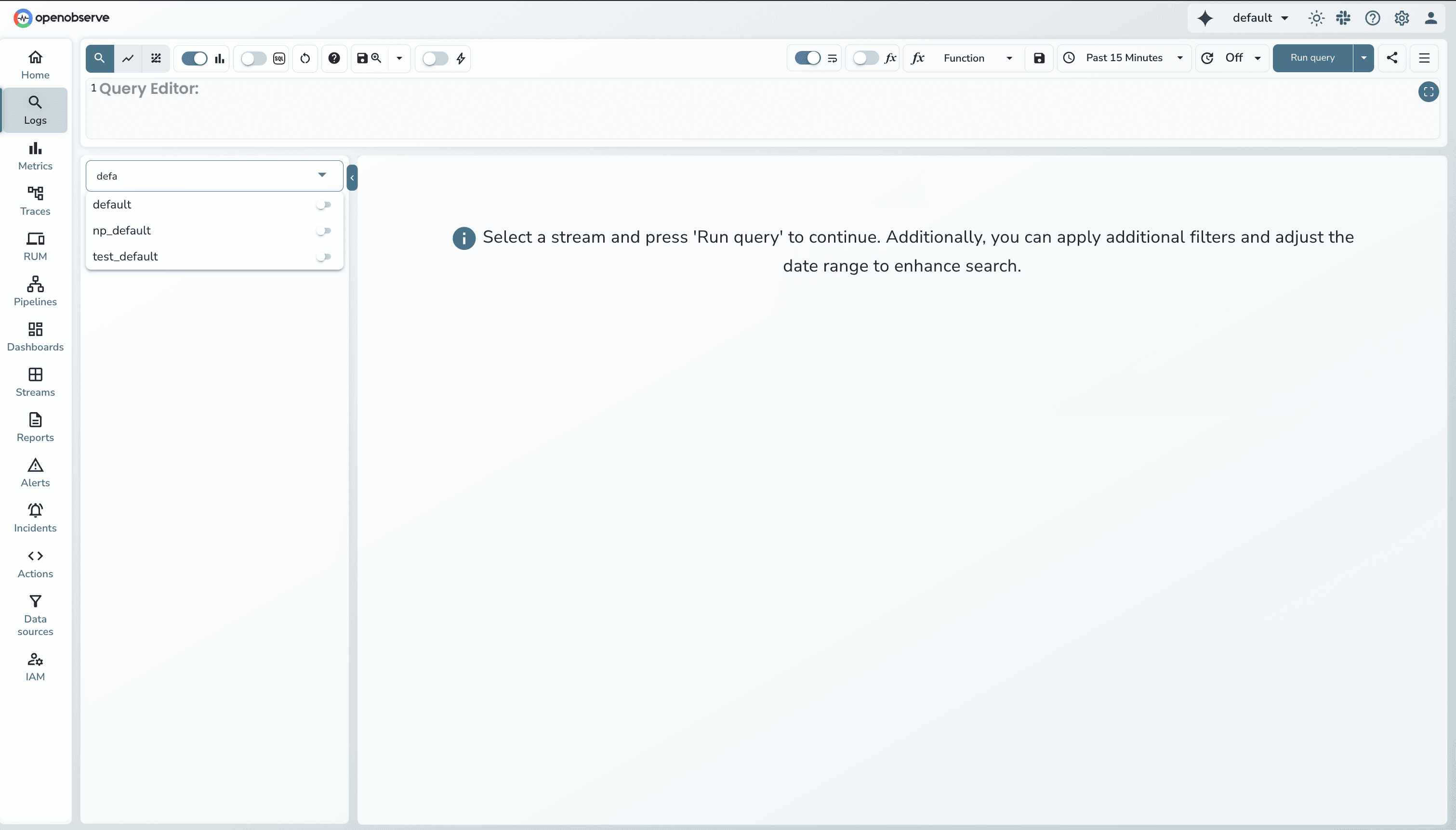 .
. - Wait for results to load then click Insights button in the top-right corner
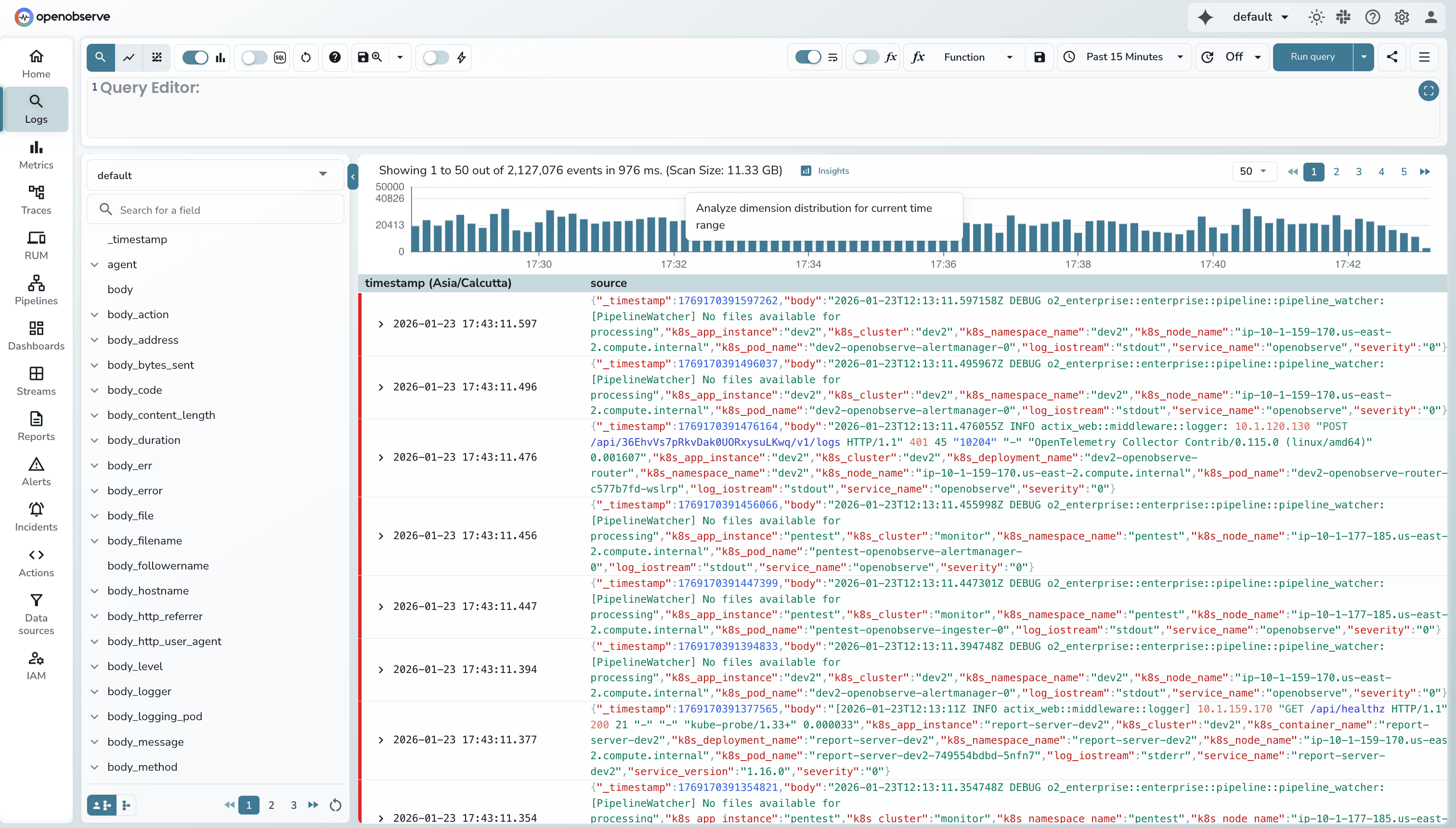
- Explore the dimension charts
That's it! Now let's dive deeper into what you're seeing.
Key Concepts: Understanding Baseline vs. Selected
Before we continue, let's clarify the terminology:
Quick Terminology:
- Stream = Your data collection/index. Example:
default,prod-logs,k8s-traces - Baseline = Your full search time range (e.g., "last 24 hours")
- Selected = The specific window you're investigating (e.g., "14:00-15:00 spike" or "traces > 1000ms")
- Dimension = A field in your data (e.g.,
service_name,pod_name,http_status_code) - Brush selection = Click-and-drag with your mouse to select regions on charts
- RED metrics = Rate, Errors, Duration - the three key observability metrics for traces
How Insights works: It compares your Selected period against the Baseline to show what's different.
What is Insights?
Insights is an interactive dimension analysis feature that compares your selected time period or metric range against baseline data across multiple dimensions simultaneously. Instead of manually testing each dimension with SQL queries, Insights automatically:
- Selects the most relevant dimensions based on your data schema
- Compares baseline vs. selected periods with normalized metrics
- Ranks dimensions by impact to show which factors most explain changes
- Visualizes differences with interactive bar charts
Result: Identify patterns in 60 seconds instead of 30 minutes of manual querying.
Insights vs. SRE Agent: When to Use Which?
Use Insights when you want:
- Visual exploration - See dimension distributions and patterns visually
- Hypothesis testing - Validate specific theories about what's causing issues
- Learning mode - Understand your system's behavior patterns
- Training - Teaching team members about troubleshooting techniques
- Quick spot checks - Fast investigation without waiting for AI analysis
Use SRE Agent when you want:
- Fully automated RCA - Let AI investigate and report findings automatically
- Comprehensive reports - Get detailed write-ups of root cause analysis
- Hands-free investigation - Start analysis and move on to other tasks
- Recurring patterns - Automatic detection and analysis of similar issues
Both tools complement each other: Use Insights for interactive exploration, then hand off to SRE Agent for comprehensive automated analysis when needed.
Use Case 1: Investigating a Latency Spike (Traces)
The Scenario
You're investigating a gRPC search operation (grpc:search:flight:do_get) that's showing variable latency. Some traces complete in milliseconds, while others are taking several seconds. You need to understand which service instances or operations are experiencing the slowest performance.
The Traditional Approach
- Write SQL queries grouping by
service_name, calculate P95 latencies - Identify problematic service
- Write more queries grouping by
operation_namewithin that service - Dig deeper into service instances and statefulset names
- Cross-reference with trace spans
- Time elapsed: 15-30 minutes
The Insights Approach
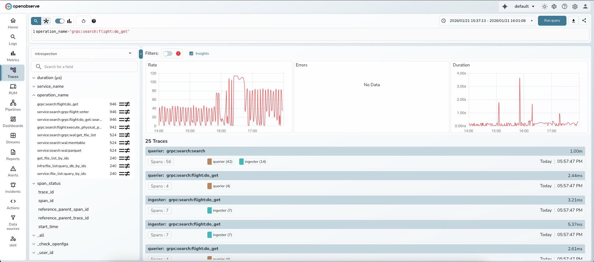
Step 1: Search traces for the specific operation
Navigate to Traces and search for your operation:
- Query:
operation_name='grpc:search:flight:do_get' - Time range: Last few hours
- Stream:
introspection
You'll see the traces list with duration information.
Step 2: Observe the RED metrics dashboard
OpenObserve automatically displays three metric panels below the search bar:
- Rate: Trace throughput over time (shows request pattern)
- Errors: Error count over time (shows "No Data" if no errors)
- Duration: Maximum trace latency over time (shows clear spikes up to 4ms)
Notice the Duration panel on the right shows significant variability.
Step 3: Select the high-latency region
Brush-select means click-and-drag your mouse across the Duration panel:
- Drag vertically (up/down) = Select Y-axis duration range (e.g., traces > 17ms)
- Drag horizontally (left/right) = Select time window (e.g., 14:00-15:00)
- Drag diagonally = Select BOTH duration AND time range for precise filtering
Tip: Click and hold your mouse, then drag across the chart. Release to complete the selection.
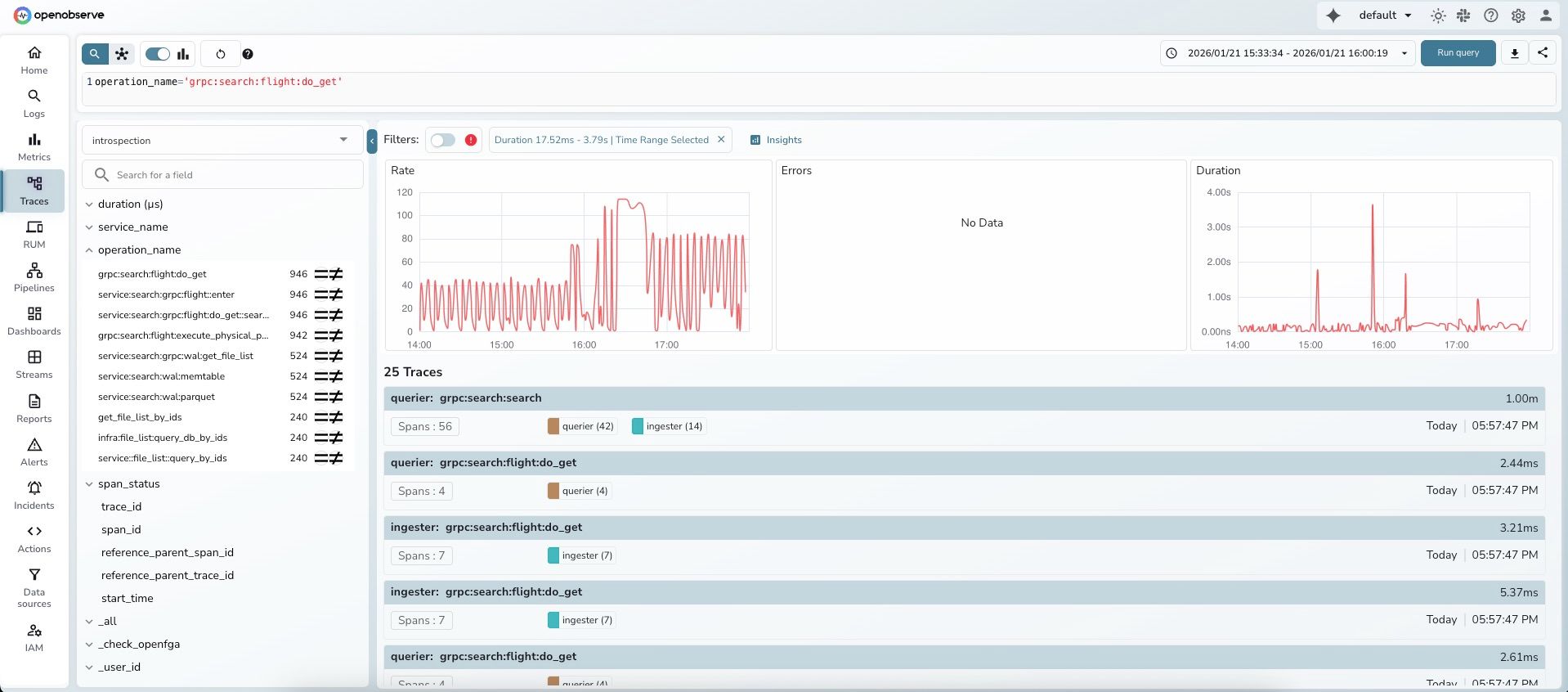
After selection, a filter chip appears showing: "Duration 17.52ms - 3.79s | Time Range Selected"
Step 4: Click "Insights"
After you make a brush selection, a filter chip appears in the Filters section showing your selection. The "Insights" button is available in the toolbar area.
Step 5: Review automated insights
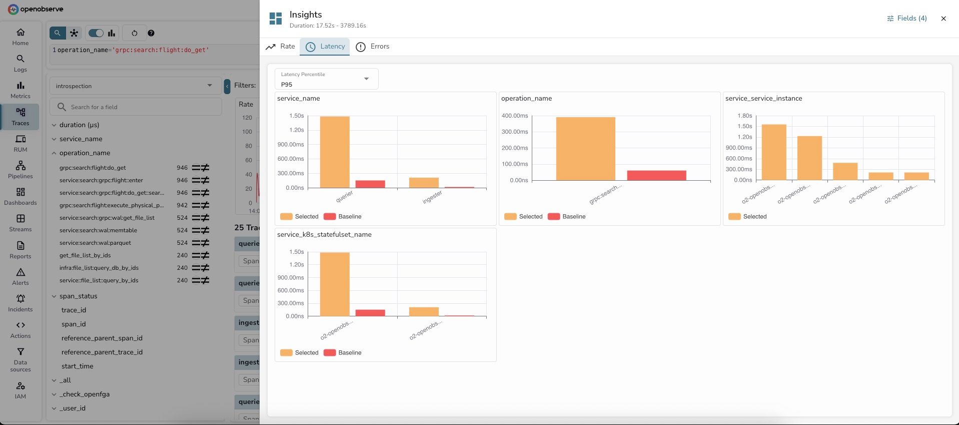
The Insights dashboard opens with three tabs: Rate, Latency, and Errors.
Latency Tab - Shows P95 latency comparison by dimension:
OpenObserve intelligently selected 4 key dimensions for analysis:
1. service_name - Service-level latency:
- querier: P95 = ~1.35s (Selected) vs ~150ms (Baseline) [9x slower]
- ingester: P95 = ~250ms (Selected) vs ~200ms (Baseline) [Similar]
Key insight: The querier service is experiencing 9x higher latency during the selected period. This immediately narrows down the investigation.
2. operation_name - Operation-level latency:
- grpc:search:...: P95 = ~350ms (Selected) vs ~50ms (Baseline) [7x slower]
Key insight: This specific gRPC search operation is the source of latency increase.
3. service_service_instance - Instance-level latency:
- o2-openobserve-...: Different service instances show varying latency patterns
- One instance has significantly higher P95 (~1.5s) than others
Key insight: The latency issue is isolated to specific service instances, not affecting all instances equally. This suggests a resource contention or localized issue.
4. service_k8s_statefulset_name - StatefulSet-level latency:
- o2-openobserve-...: P95 = ~1.4s (Selected) vs ~100ms (Baseline) [14x slower]
Key insight: The OpenObserve statefulset pods are experiencing the latency spike.
Step 6: Switch to Rate tab for volume analysis
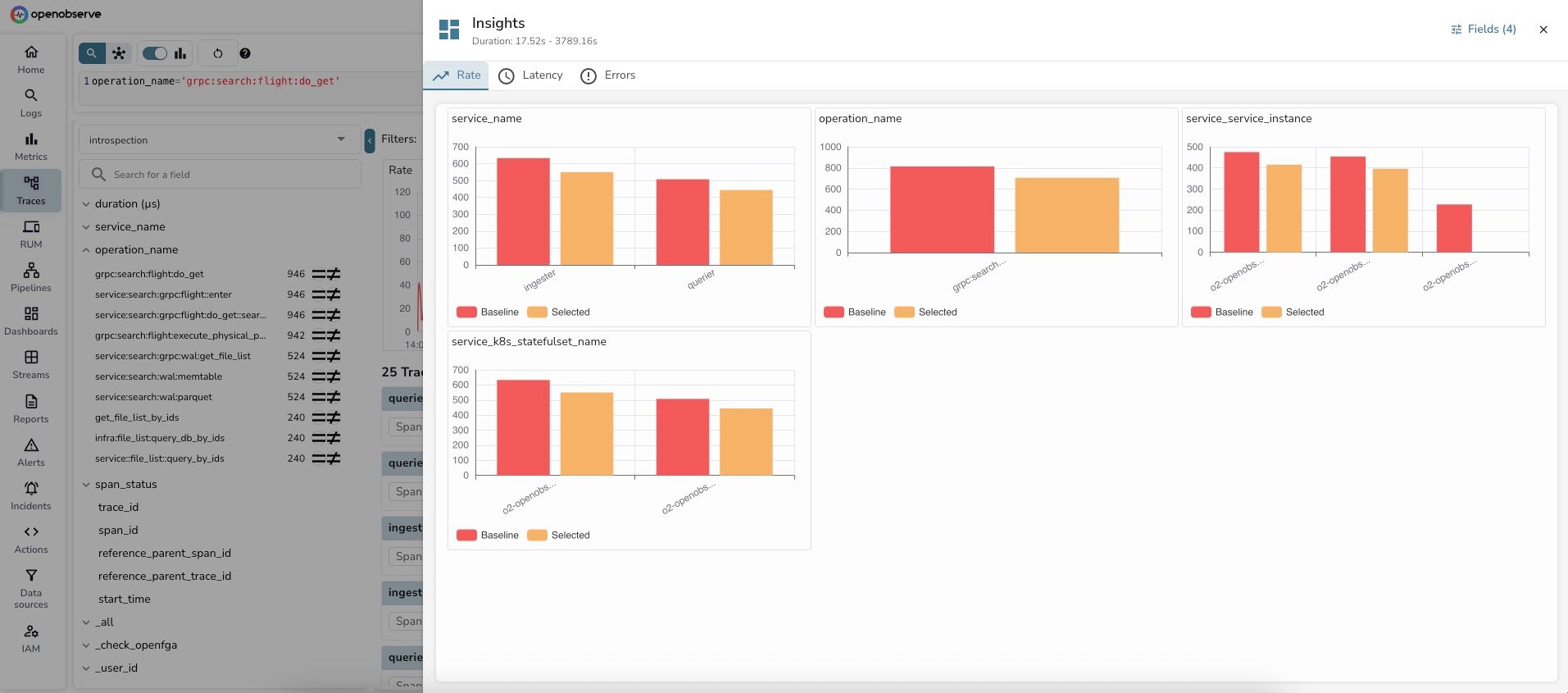
The Rate tab shows trace count distribution:
1. service_name - Request volume:
- ingester: ~550 traces (Baseline) vs ~550 traces (Selected) [Similar volume]
- querier: ~500 traces (Baseline) vs ~450 traces (Selected) [Slightly lower]
2. operation_name - Operation volume:
- grpc:search:...: ~800 traces (Baseline) vs ~650 traces (Selected)
3. service_service_instance - Instance distribution:
- Shows relatively balanced distribution across instances
- o2-openobserve-...: ~450 traces (Baseline) vs ~400 traces (Selected)
Key insight: The volume analysis reveals that trace counts are actually lower during the selected high-latency period. This rules out a "too much traffic" hypothesis and points to a different root cause - likely resource contention, slow queries, or external dependency issues.
Step 7: Identify the root cause
In less than 60 seconds, you've identified:
- Service:
querierservice has 9x higher P95 latency - Operation:
grpc:search:flight:do_getoperation is the bottleneck - Instance: Specific service instances are affected more than others
- Volume: Lower trace volume during high latency (rules out overload)
Diagnosis: The querier service's gRPC search operation is experiencing slow performance on specific instances, despite lower traffic volume. This suggests:
- Possible resource contention (CPU/memory) on specific pods
- Slow underlying data queries
- External dependency latency
- Need to check pod resource utilization and query patterns
Time elapsed: 60 seconds from search to diagnosis
Use Case 2: Understanding Log Volume Distribution
The Scenario
You're investigating log patterns for your Kubernetes cluster running OpenObserve. You want to understand which pods, services, and namespaces are generating the most logs during a specific time window to optimize resource allocation and logging costs.
The Insights Approach
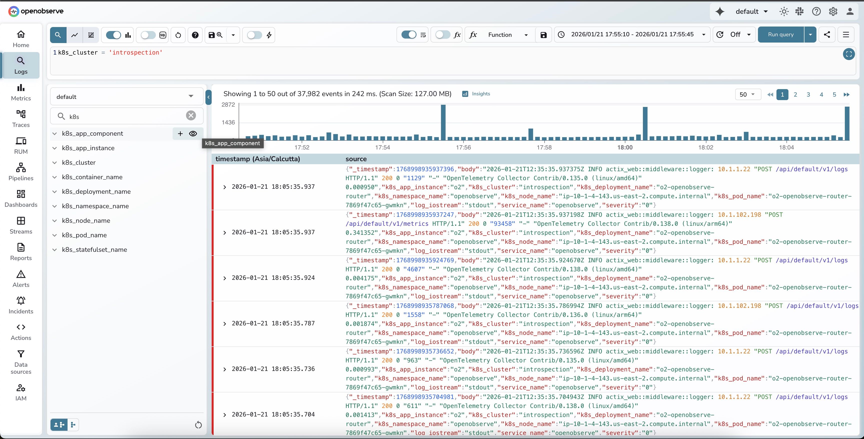
Step 1: Search logs for your cluster
Navigate to Logs and search your stream with a filter:
- Stream:
default - Query:
k8s_cluster = 'introspection' - Time range: Recent time window (e.g., last hour)
You'll see your log results with a histogram showing volume distribution over time.
Step 2: Click "Insights"
In the top-right corner of the search results page, click the "Insights" button. It appears automatically when you have log results loaded.
Step 3: Review dimension distribution
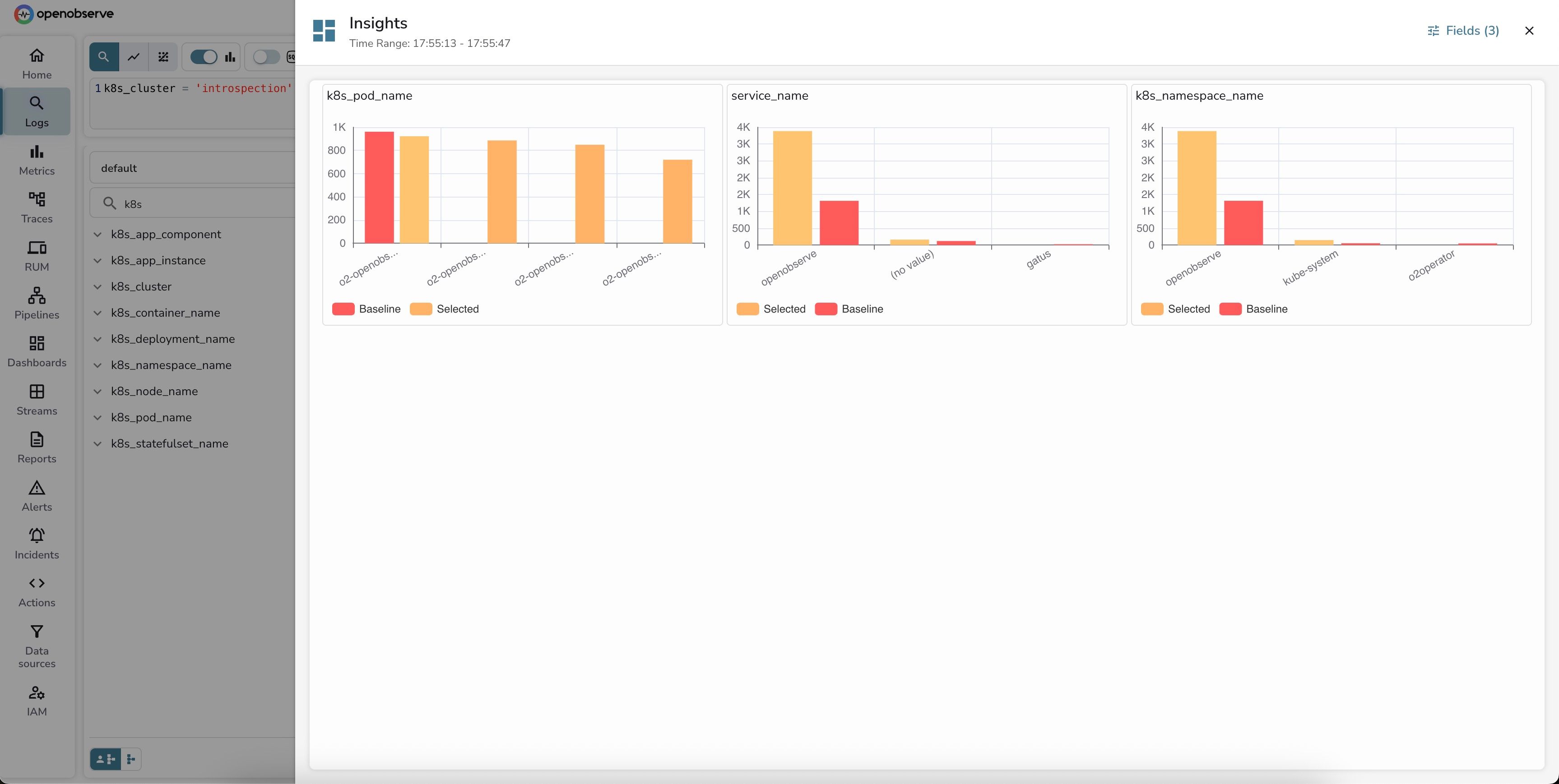
OpenObserve automatically generates an Insights dashboard comparing log volume across the most relevant dimensions. The system intelligently selected 3 key dimensions:
The Insights panel shows a clean, side-by-side comparison with bar charts. Notice the "Fields (3)" indicator in the top right - that's how many dimensions were auto-selected.
Let's break down what each panel reveals:
1. k8s_pod_name - Pod-level distribution:
- o2-openobserve-router-0: ~900 logs (Baseline: ~1000 logs) - Slightly decreased
- o2-openobserve-ingester-0: ~850 logs (Baseline: similar) - Stable
- o2-openobserve-querier-0: ~850 logs (Baseline: similar) - Stable
- o2-openobserve-compactor-0: ~700 logs (Baseline: similar) - Stable
Key insight: The router pod shows a slight decrease in log volume during the selected period, while other components remain stable. This indicates normal, balanced operation across the distributed system.
2. service_name - Service attribution:
- openobserve: ~3500 logs (Selected) vs ~1500 logs (Baseline) [133% increase]
- (no value): ~1500 logs (Baseline) vs ~200 logs (Selected) [87% decrease]
- gatus: ~200 logs (Baseline) vs ~50 logs (Selected) - Minor monitoring service
Key insight: There's a significant improvement in telemetry quality! During the selected period, far fewer logs are missing the service_name tag. This suggests better instrumentation or a configuration fix was applied, improving observability.
3. k8s_namespace_name - Namespace distribution:
- openobserve: ~3500 logs (Selected) vs ~1800 logs (Baseline) [94% increase]
- kube-system: ~300 logs (Baseline) vs ~150 logs (Selected) [50% decrease]
- o2operator: ~100 logs (Baseline) vs minimal (Selected) - Operator is quieter
Key insight: The openobserve namespace is significantly more active in the selected period, while system namespaces (kube-system, o2operator) are quieter. This could indicate increased application activity or better application-level logging.
Step 4: Overall analysis
Combining insights from all three dimensions:
- Balanced load: Pod distribution shows healthy, balanced logging across components
- Improved telemetry: Dramatic reduction in untagged logs (from 1500 to 200)
- Application focus: Shift from system logs to application logs indicates better instrumentation
- Normal operation: No alarming spikes or anomalies detected
Actionable outcome: The selected time period shows improved observability posture with better tagging and more application-level insights. This is the kind of positive trend you want to see after improving instrumentation.
Time elapsed: 45 seconds to identify the pattern
Customizing Your Analysis
Notice the "Fields (3)" button in the top-right corner of the Insights panel? Click it to open the dimension selector:
- See which dimensions were auto-selected (k8s_pod_name, service_name, k8s_namespace_name)
- Add more dimensions like
k8s_deployment_name,k8s_node_name,severity, ork8s_container_name - Remove dimensions that aren't relevant to your investigation
- Search for specific field names using the search box
Why these dimensions? The dimension selector is smart - it pre-selects fields with optimal cardinality (2-50 unique values work best) to give you meaningful insights without overwhelming you with noise.
How It Works
Smart Dimension Selection
OpenObserve automatically selects the most relevant dimensions for analysis:
For Traces: Prioritizes OpenTelemetry conventions like service_name, operation_name, http_status_code, db_operation
For Logs: Analyzes your schema to select fields with optimal cardinality (2-50 unique values) and high coverage
Customization: Click the "Fields (X)" button to add/remove dimensions or search for specific fields
Baseline vs. Selected Comparison
- Baseline: Your full search time range (e.g., "last 24 hours")
- Selected: The filtered subset you're investigating (e.g., "14:00-15:00 spike" or "traces > 1000ms")
Insights normalizes metrics to enable fair comparison. For example, if your baseline is 24 hours but your selected period is 1 hour, it calculates: "If the baseline were compressed to 1 hour, what would we expect?"
Analysis Types
- Rate/Volume: Count of traces or logs by dimension
- Latency (Traces): Percentile latency (P50/P75/P95/P99) by dimension
- Errors (Traces): Error percentage by dimension
Using Insights
Want detailed step-by-step instructions? Check out our Insights documentation for complete usage guides for both logs and traces.
What to Do After Using Insights
Drill down: Click individual traces/logs to examine full details, stack traces, or error messages
Apply filters: Use findings to narrow your search (e.g., service_name='querier' AND duration > 1000ms)
Check infrastructure: Verify pod resources, database connections, external API latency
Hand off to SRE Agent: Use OpenObserve's AI-powered SRE Agent for automated root cause analysis and comprehensive reports
Create alerts: Set up alerts based on identified patterns for future incidents
Document findings: Add screenshots to tickets, update runbooks with patterns
Frequently Asked Questions
Q: What is the Insights feature in OpenObserve?
A: Insights is an interactive dimension analysis tool that compares your selected time period or metric range against baseline data across multiple dimensions. It automatically selects relevant dimensions, compares metrics, and ranks them by impact to help identify root causes in 60 seconds.
Q: How is Insights different from the SRE Agent?
A: Insights provides visual, interactive exploration where you control the investigation, perfect for hypothesis testing and learning. SRE Agent offers fully automated AI-powered root cause analysis with comprehensive reports. Use Insights for hands-on exploration and SRE Agent for automated investigation.
Q: Can I use Insights for both logs and traces?
A: Yes! Insights works with both logs and traces. For logs, it analyzes volume distribution across dimensions. For traces, it provides Rate, Latency, and Error analysis with percentile breakdowns.
Q: What are the minimum requirements to use Insights?
A: You need search results with at least 10 events. For traces, you get RED metrics automatically. For logs, the Insights button appears when results are loaded. Optionally, use brush selection to focus on specific time ranges or metric values.
Q: How does Insights select which dimensions to analyze?
A: For traces, Insights prioritizes OpenTelemetry conventions like service_name and operation_name. For logs, it analyzes your schema to select fields with optimal cardinality (2-50 unique values) and high coverage. You can customize dimensions via the "Fields (X)" button.
Try OpenObserve
- Cloud: cloud.openobserve.ai
- Self-Hosted: openobserve.ai
Resources:
Coming Soon: SRE Agent Deep Dive
Stay tuned for our next blog exploring OpenObserve's AI-powered SRE Agent for fully automated root cause analysis, comprehensive RCA reports, and integration with Insights.
Happy Observing!
About the Author
Ashish Kolhe


Ashish leads Engineering at OpenObserve. Ashish is obsessed with building high performance systems with simplicity in mind. He has vast experience in multiple disciplines like streaming, analytics, big data and more.
Follow OpenObserve on Google
Add OpenObserve as a preferred source to see more of our articles in Google Search and Top Stories.